1 / Context
1.1 / Company
Users come to Tripadvisor’s Hotels page to find accommodations for their trips. In popular destinations like NYC or Paris, there are hundreds or even thousands of properties on the list. Imagine your frustration when you are facing such an overwhelmingly long list and trying to choose the one right place to stay.

1.2 / Problem
Only 13% of users interact with the filters on the hotel list page.
1.3 / Goal
Improve the filter experience to help users zero in on the right property while having some fun.
1.4 / Role
I worked as the sole product designer, collaborating with 3 product managers, 6 software engineers, 2 data scientists, a business analyst, and a content writer.
2 / Strategy
2.1 / Approach
By reframing the filters as a series of conversational questions, we guide the user through more of the filter feature-set, demonstrating its benefits and usefulness, while not overburdening the user with manual work.
2.2 / Strategy
Before deciding what questions to ask the user, or how to ask them, it's critical to remember what we want them to gain from the whole experience - we want to empower the user to find the accommodations that best fit their needs, so that they can make an efficient and informed decision.
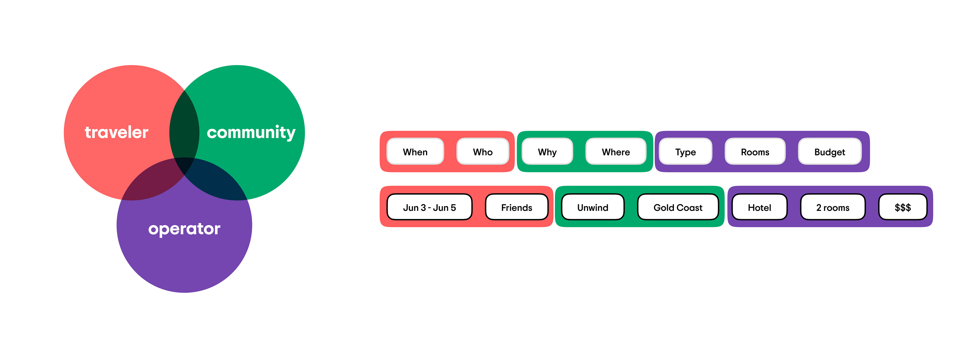
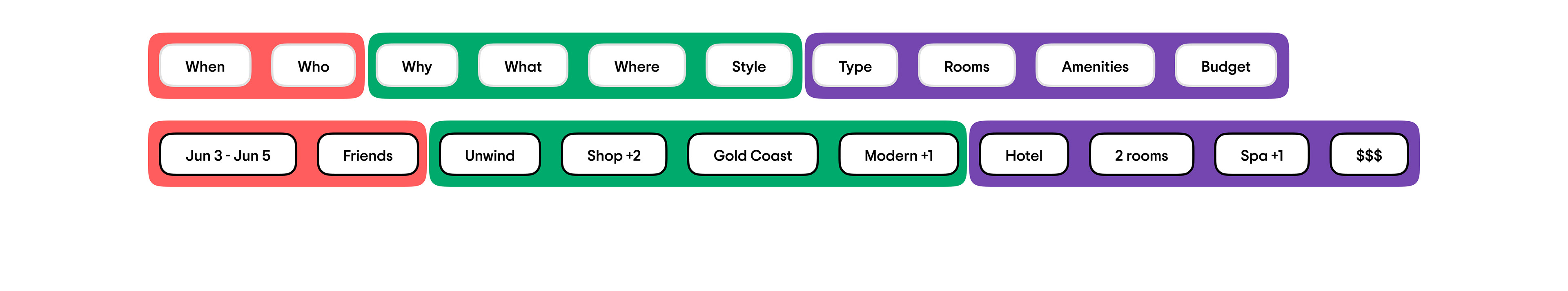
To achieve this, we collect and utilize data from three distinct stakeholder groups: travelers, community members, and operators. Each group provides a slice of the data that helps complete the recommendation list for our user.
The traveler - questions that are unique to a user.
The community - questions that other travelers contribute to answering.
The operator (category) - questions specific to the accommodation owner & relevant to their specific property.
The community - questions that other travelers contribute to answering.
The operator (category) - questions specific to the accommodation owner & relevant to their specific property.
3 / Research Highlights
3.1 / Users Desire Personalization
82% of travelers are willing to provide information about their habits and preferences to receive personalized recommendations.
3.2 / Concept Was Seen as Helpful by Users
We interviewed 20 people in-person and observed them as they answered filtering questions through a similar feature on a competitor’s website.
1. Across both user groups (business & leisure), interviewees generally found this feature to be very useful. The questions were perceived to be a quicker, more streamlined way to narrow the list.
2. Users intuitively understood that the questions would function the same way as filters.
3. It’s less about the number of questions, it’s more about the quality of the questions.
3.3 / No Preferred Question Order
We asked 100 people to conduct a card sorting exercise on usertesting.com in order to figure out the right question sequence. The result showed there were 90+ unique question orders, with no particular order repeating more than twice. 4 / Design Iteration 1
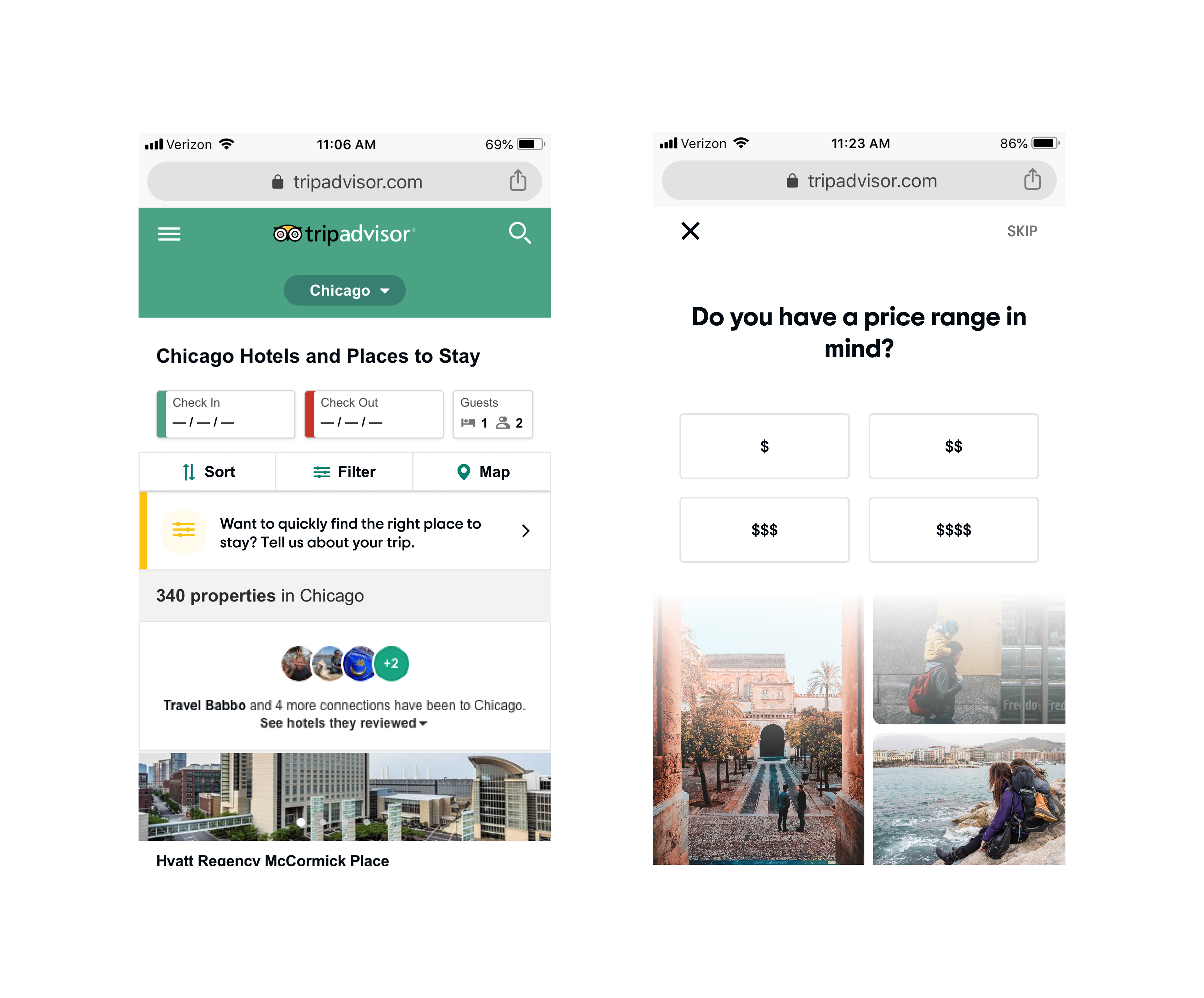
Conspicuous, but not obtrusive
The inline entry point allows for a natural transition to the fullscreen experience and prevents it from otherwise getting in the user’s way.
A user who enters the flow is able to fully immerse in the experience without distraction.
Conversational and trust-worthy
The flow opens a dialog with the user, both through visuals and language. Easy navigation keeps the user in control as they personalize their shopping experience.
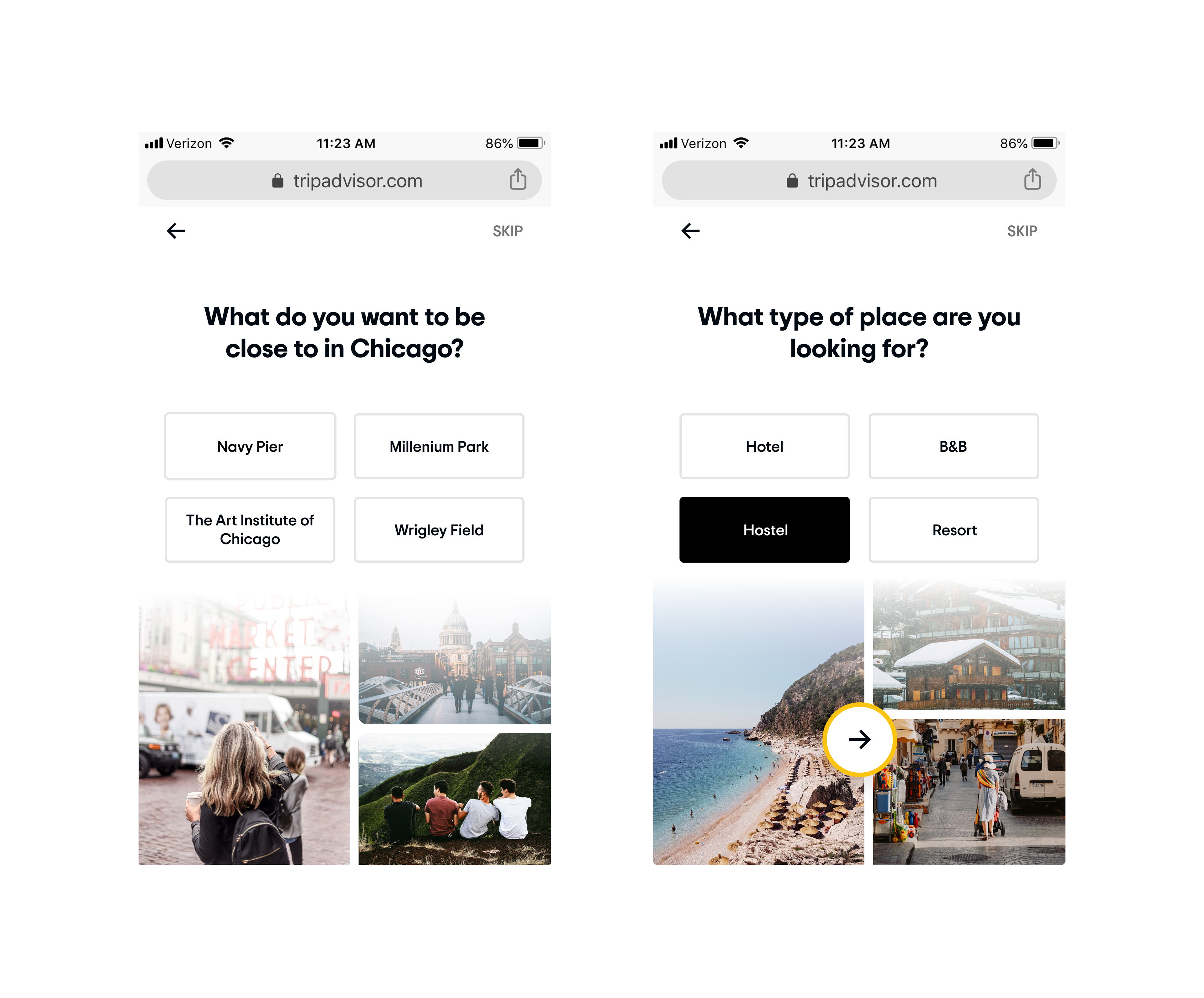
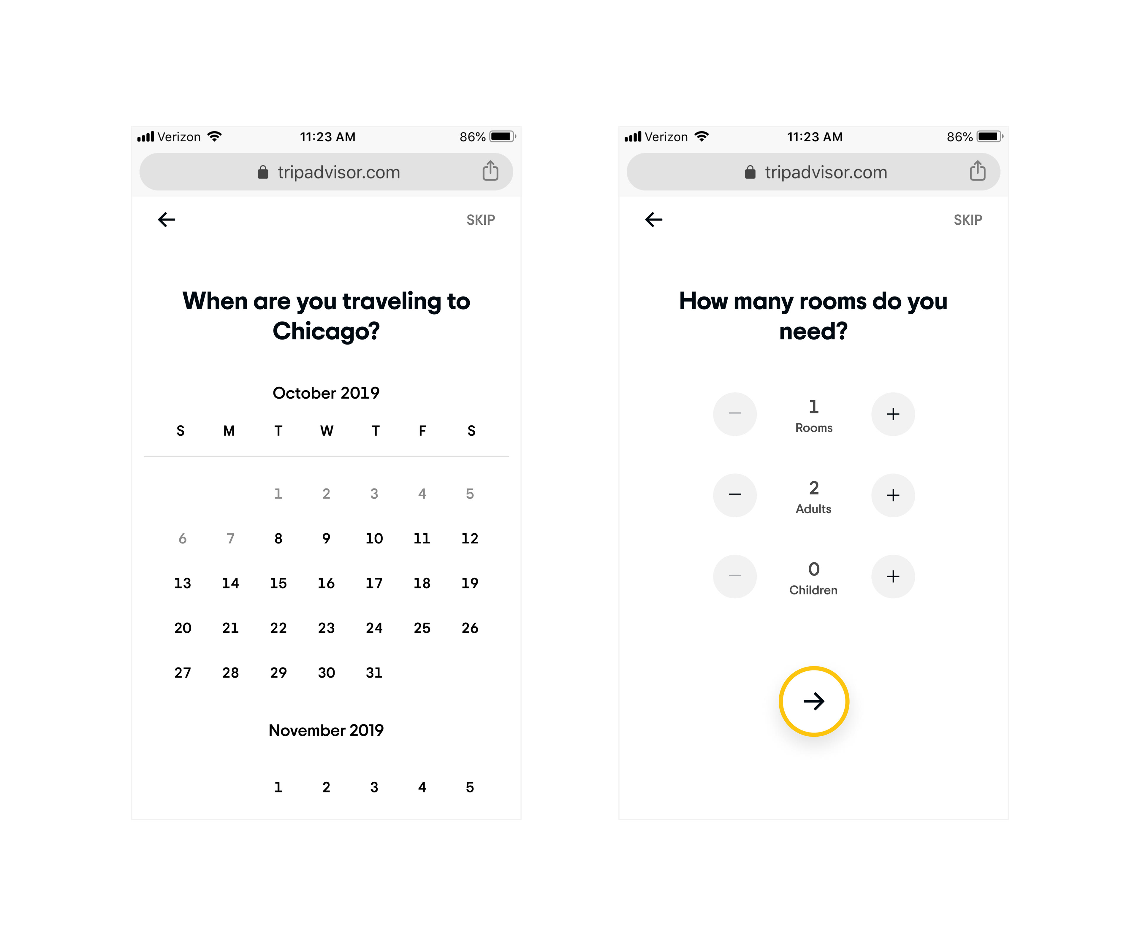
One task at a time
Focusing the user’s attention on individual, approachable questions makes them feel capable and sparks delight, avoiding what could otherwise be a tedious, overwhelming, or complex task.
5 / Test Result
The design was A/B tested on the live site for 2 weeks. The overall bookings per shopper increased, with confidence, while the booking rate remained flat.
The engagement rate was 7% on desktop and 2% on mobile.
The completion rate was 25% on desktop and 40% on mobile.
In light of the low engagement and completion rates, we decided to do a second round of design iteration to improve the whole experience to be more helpful and delightful.
6 / Design Iteration 2
This time we would be more ambitious about the number of questions to ask.
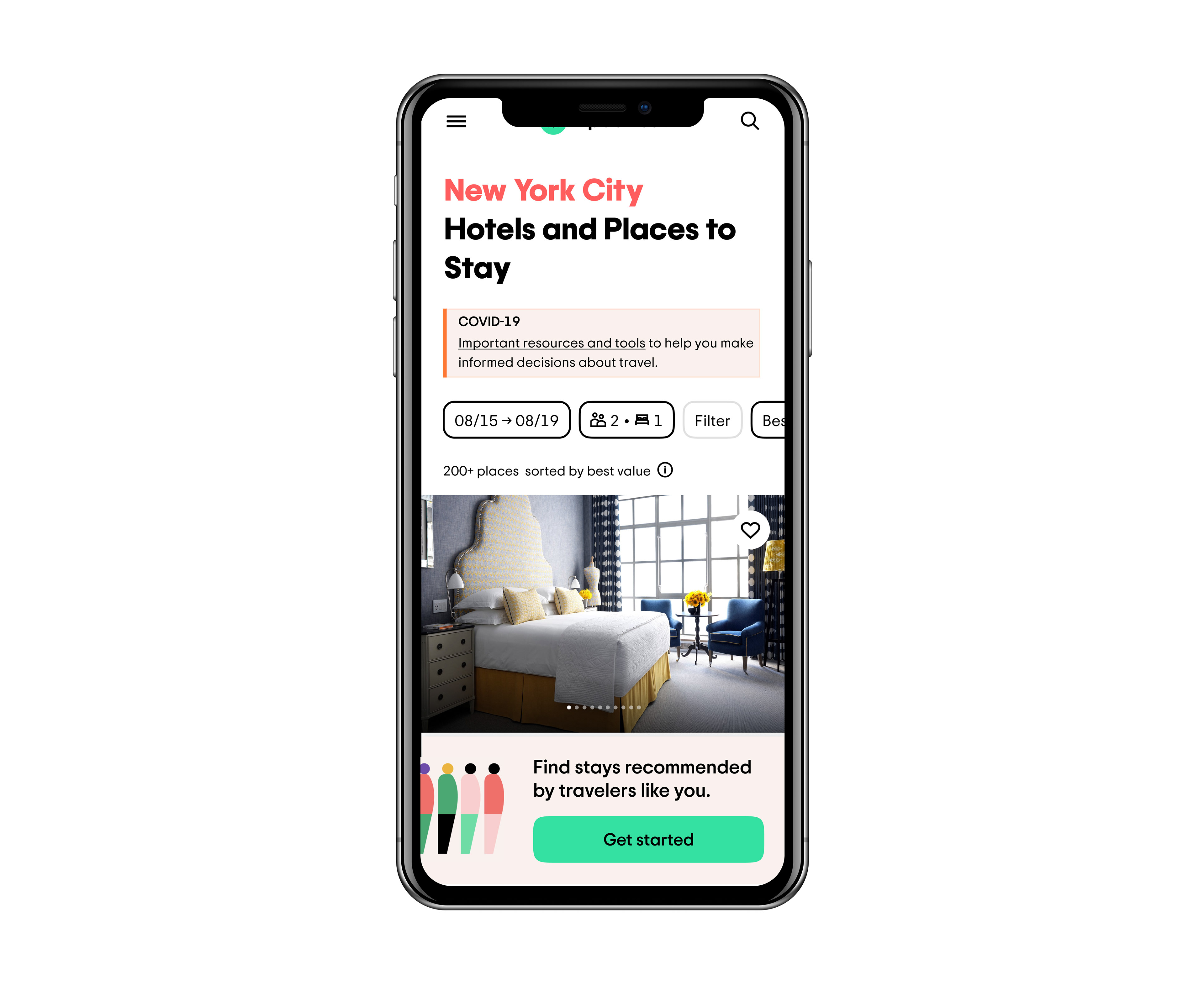
More prominent entry point
An eye-catching CTA encourages users to engage with the experience.
Flexible travel dates
By not requiring specific travel dates, users are encouraged to explore.
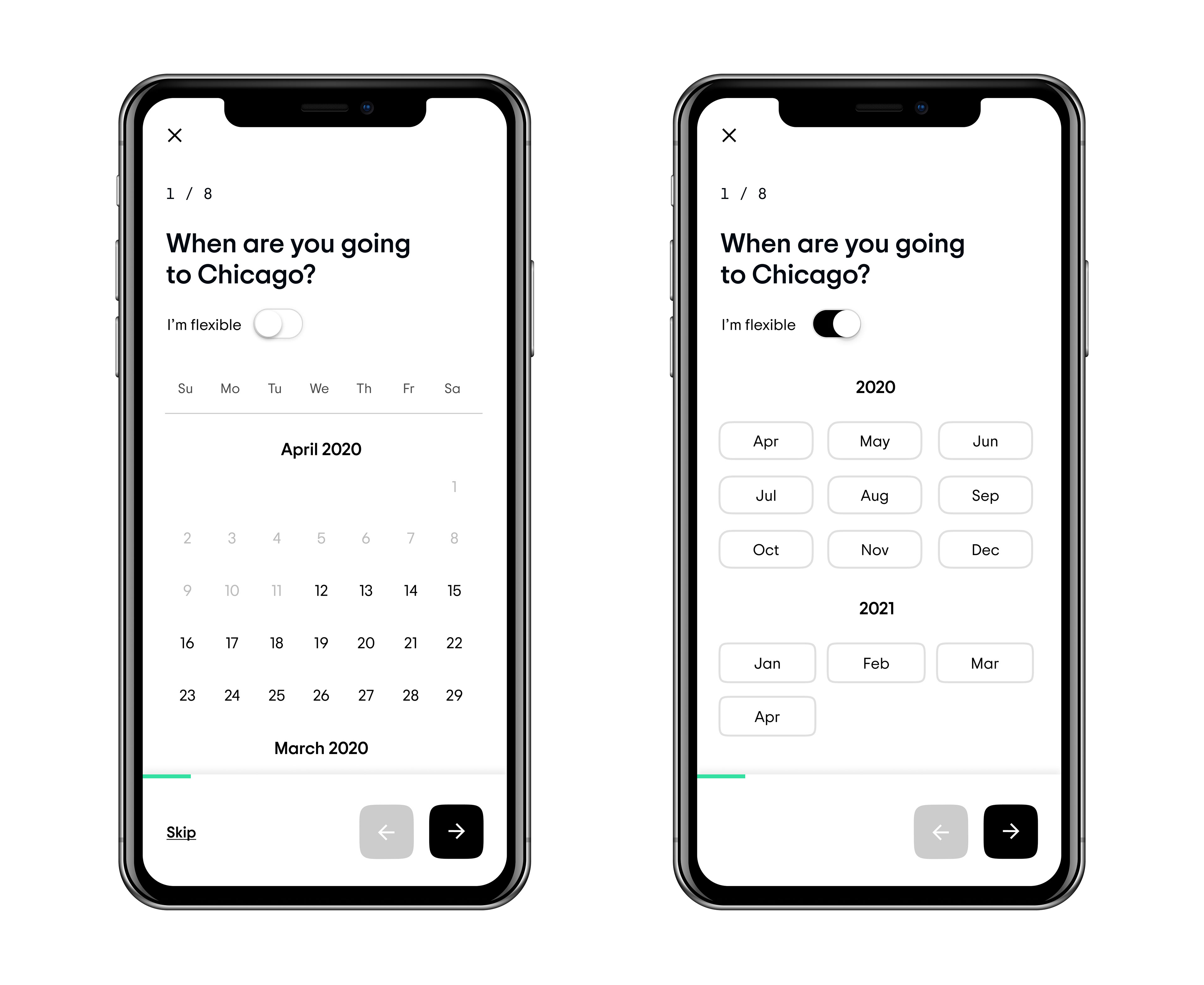
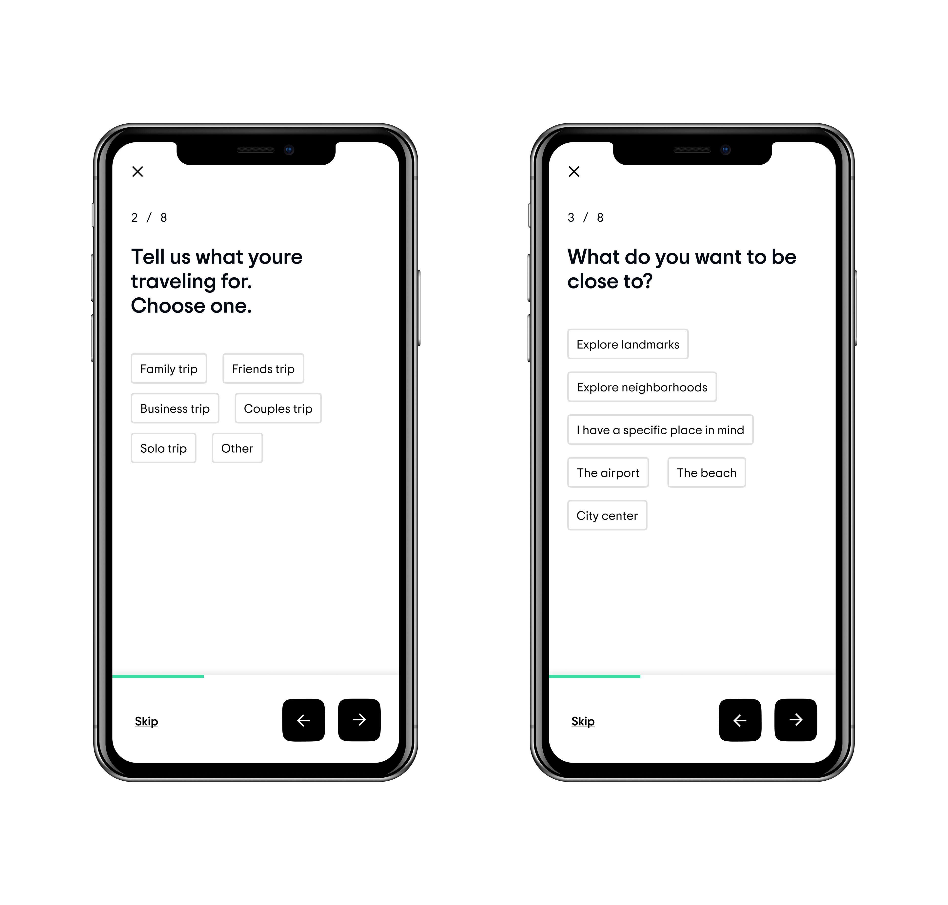
Consistent navigation and progress indicator
Persistent UI elements subtly reinforce reliability and trust-worthiness.
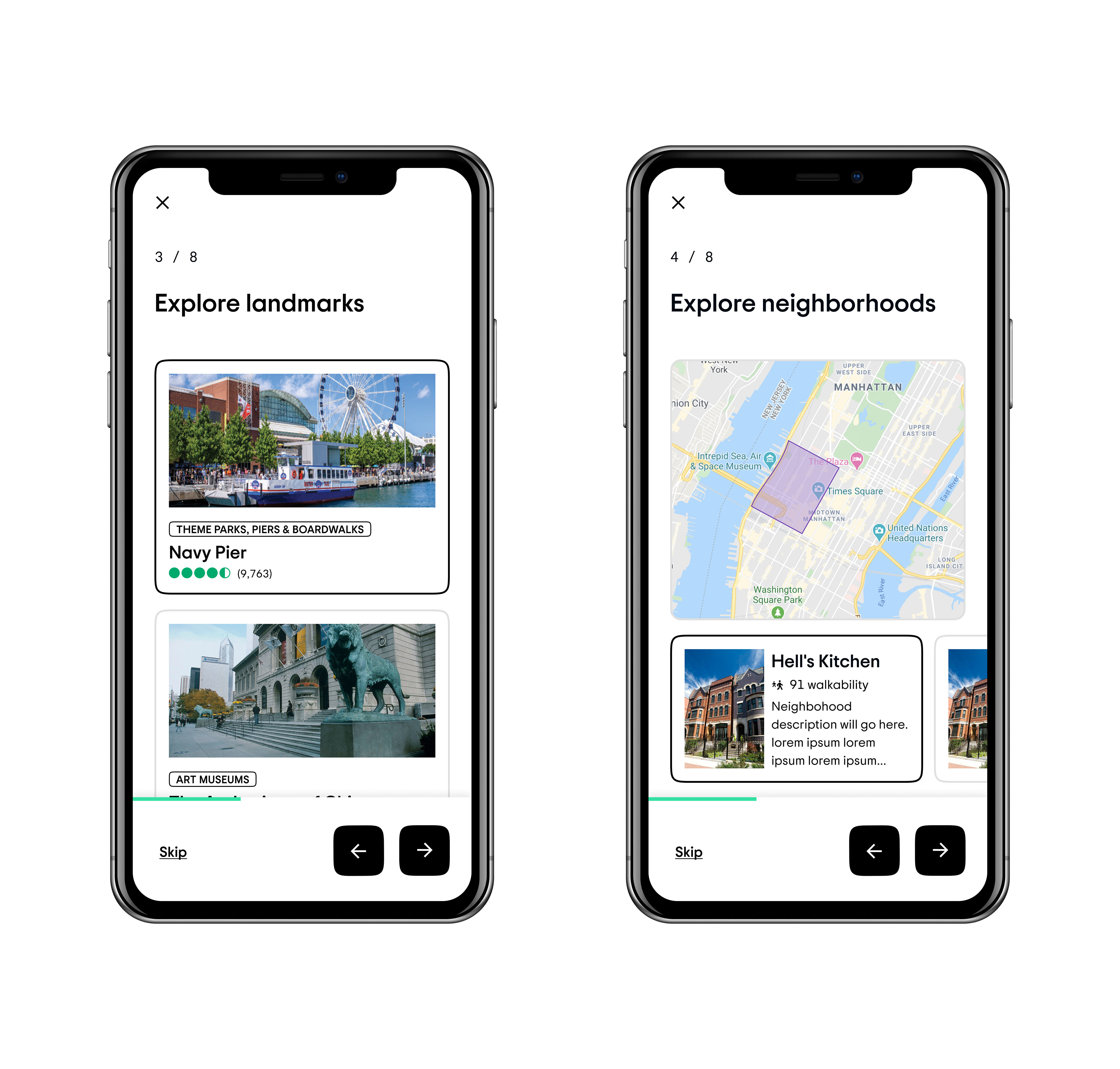
Diversified card design
Specialized cards provide the user more detailed and helpful information when making their choices.
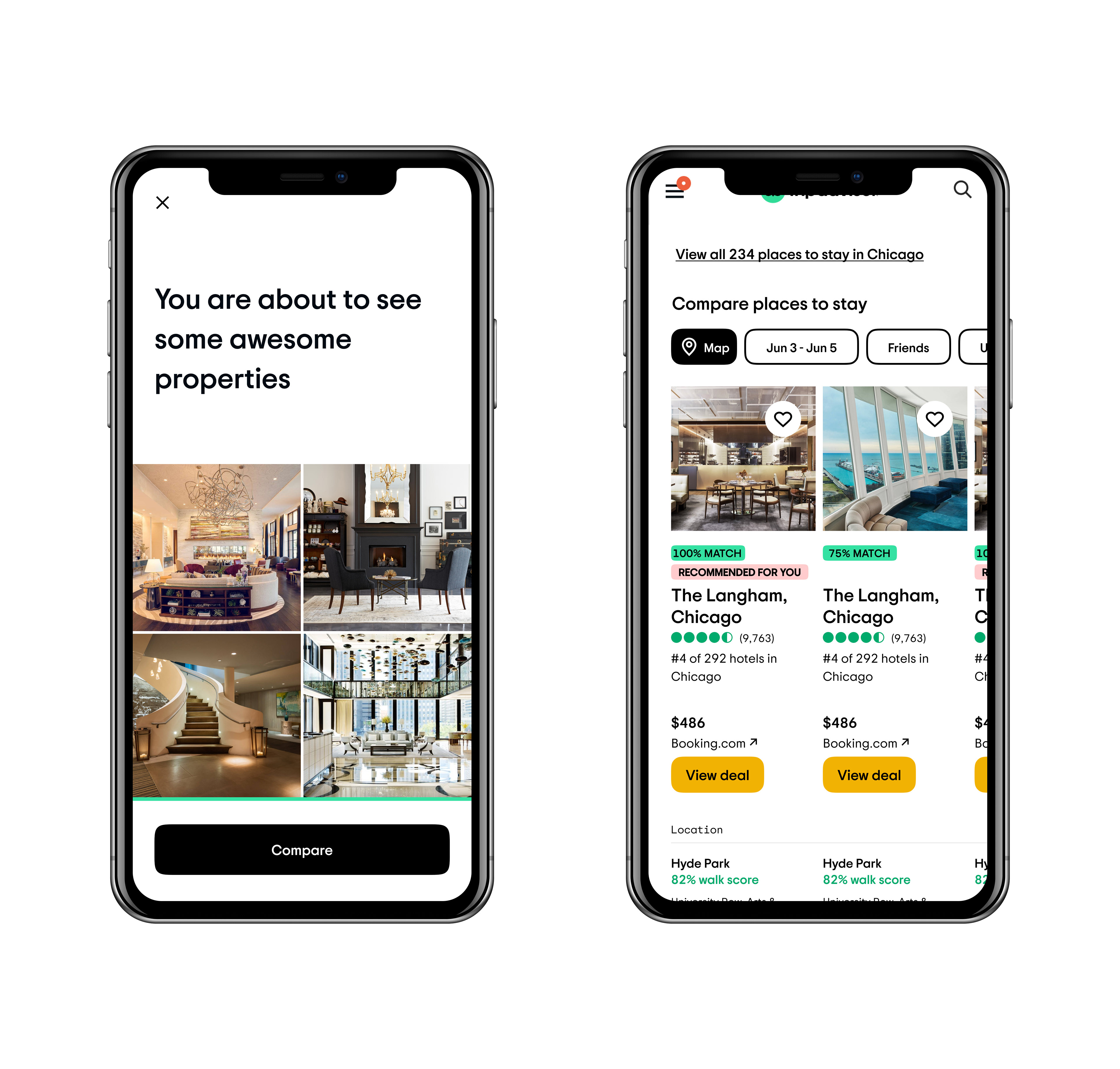
Loading state and pay-off state
Encouraging copy and bright, explanatory labels emphasize the value of the feature in a way that the user can easily digest to help make their decision.
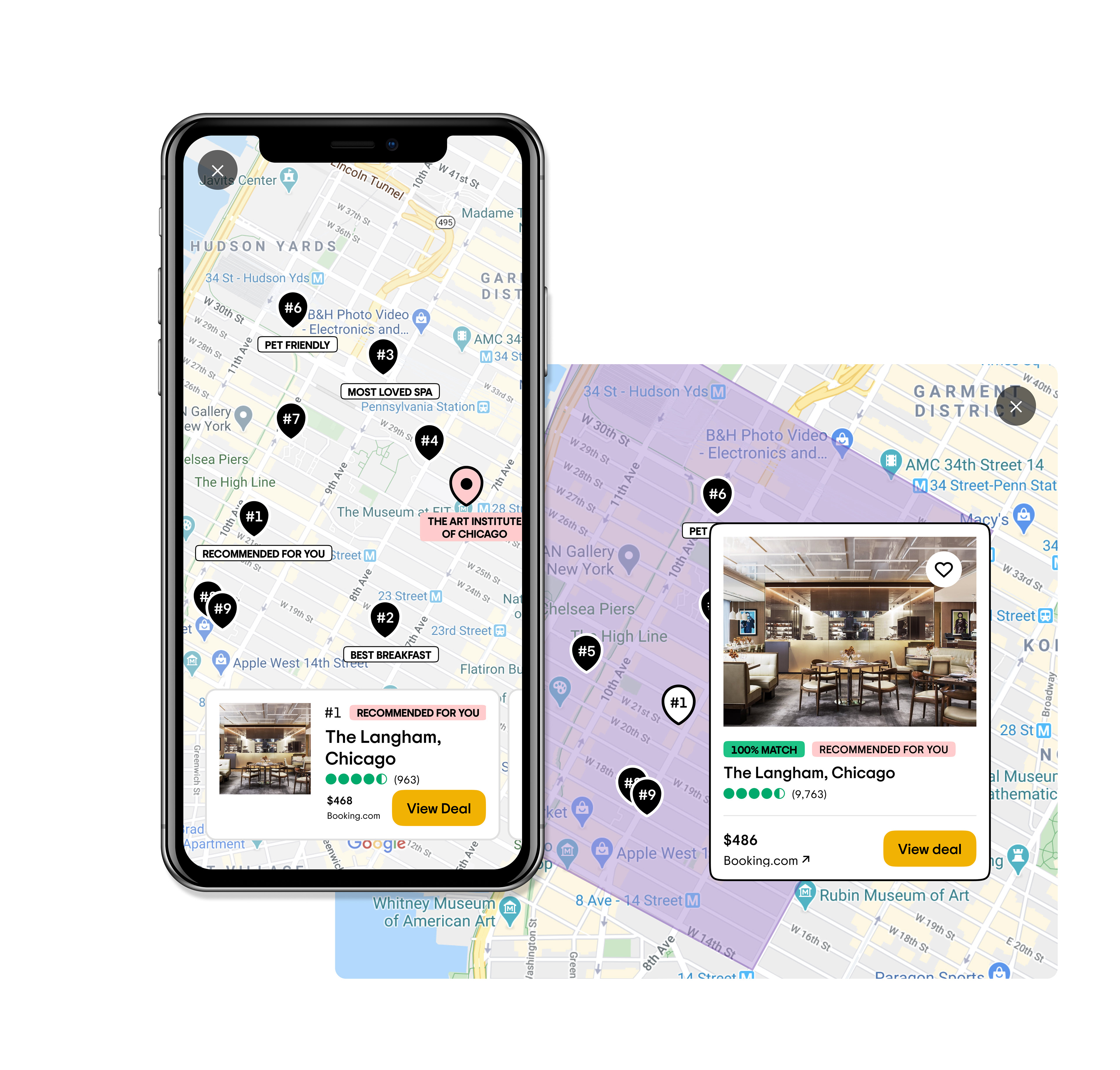
Map view
Applying similar visual feedback and labels on the map creates a more comprehensive experience.
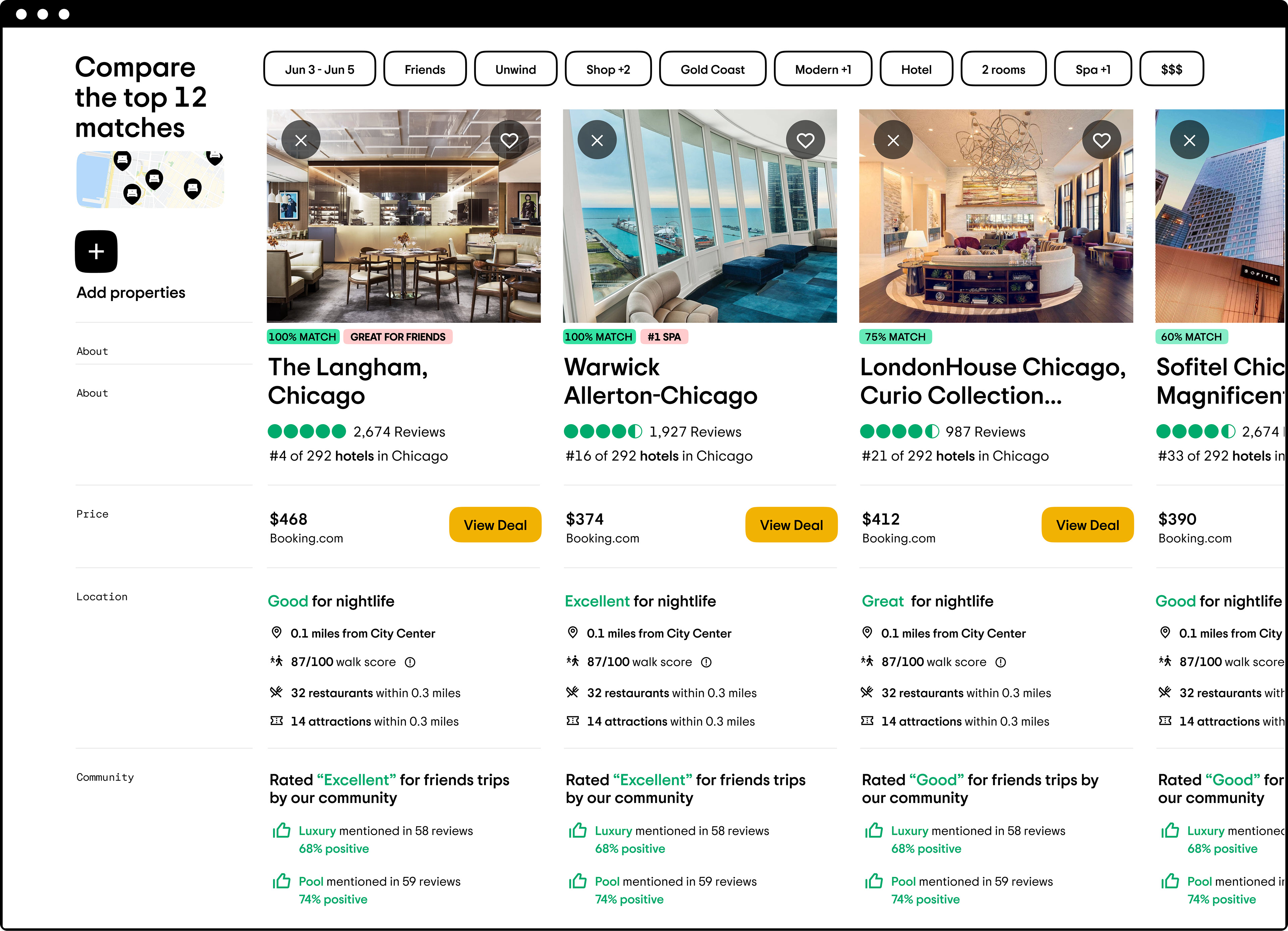
Comparison Grid on Desktop
In this iteration, I focused on making sure that the user receives the most empowering and helpful outcome from the experience. I designed a comprehensive, hotel comparison chart that showcases all of the indicators that we extracted from the user’s answers while highlighting the most important differences between each of our recommendations. This layout transforms dense data into something digestible and engaging for the user by visibly incorporating their answers into our reasoning and providing both qualitative and quantitative reinforcement from the travel community. Despite being so data-rich, this display is also very humanizing, demonstrating that we are partners with the traveler, actively listening to their needs, and providing our best advice.